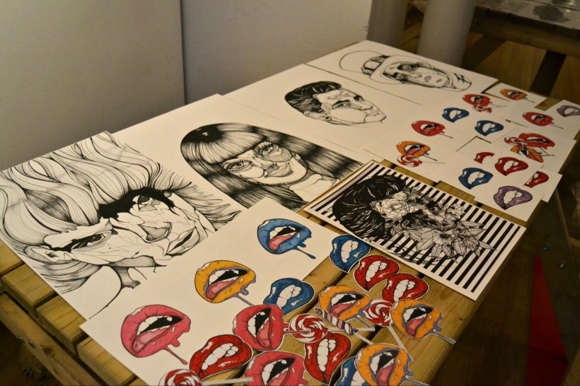
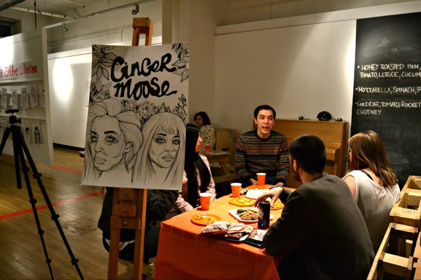
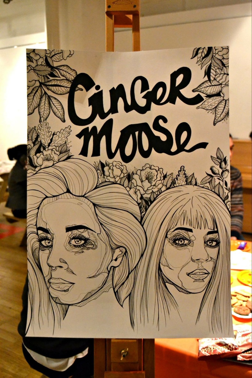
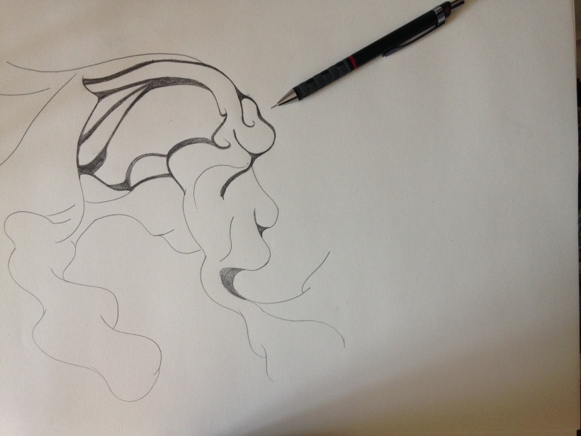
As part of design competition, myself and Marta collaborated in a solo exhibition entitled ‘GingerMoose’, we decided on the name through personal nicknames for one another and the idea of possibly forming a studio after graduation. The preparation for the exhibition for me involved finishing of the pieces for the collection of art I was going to show, buying paper for prints to sell, budgeting for printing cost and material buying, sourcing cord to hang my prints from, nails etc.
Setup problems..
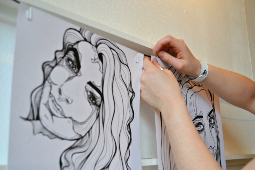
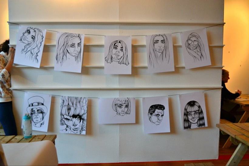
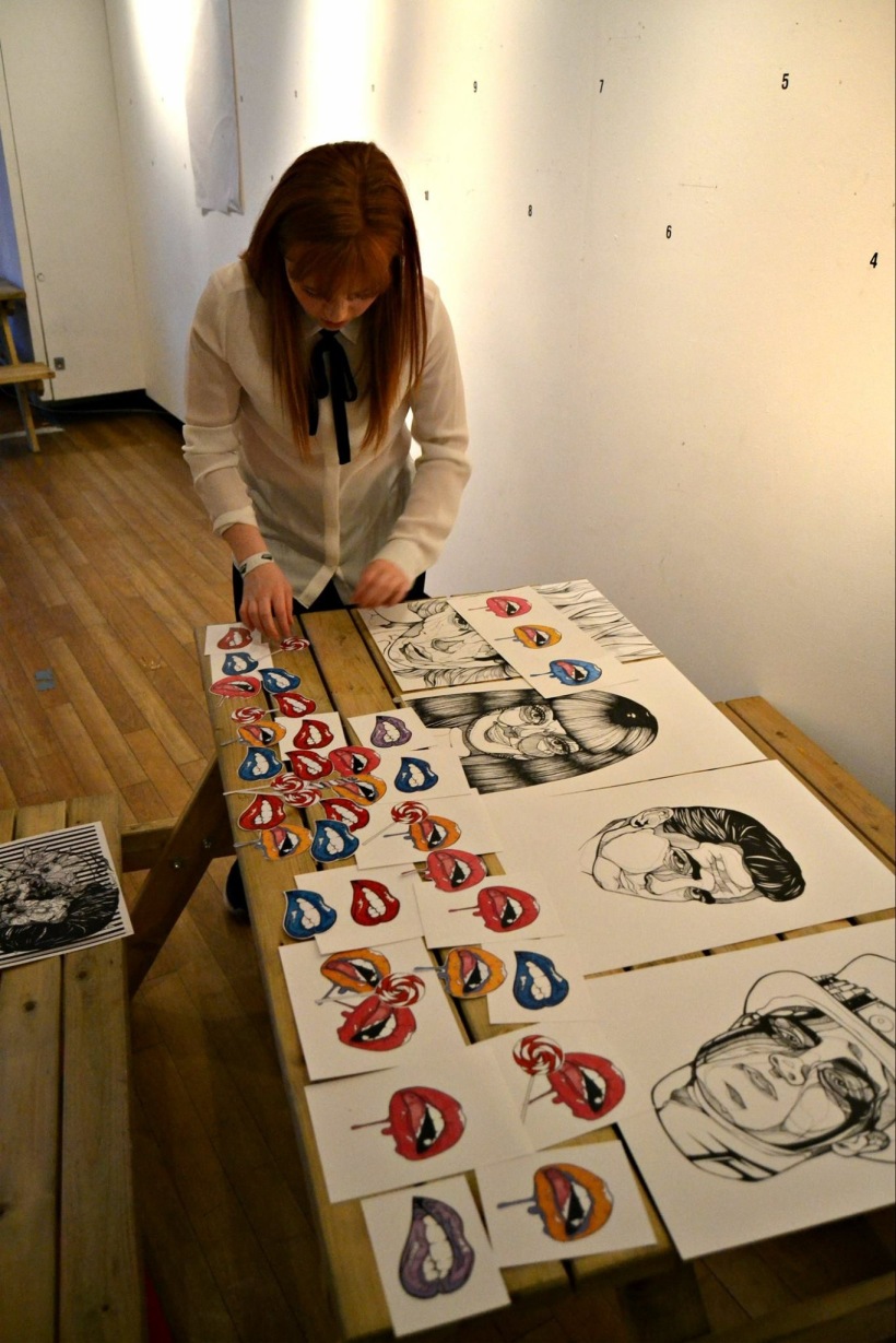
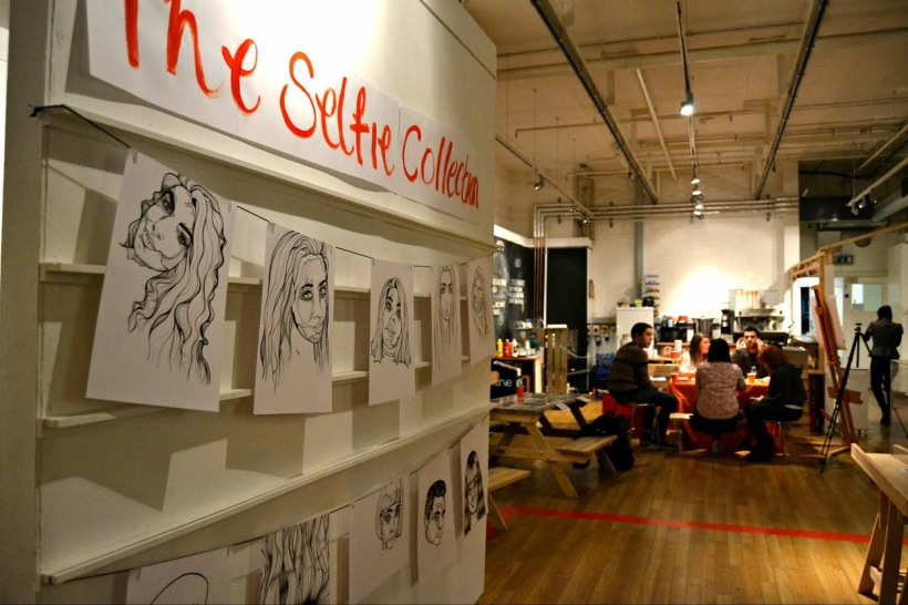
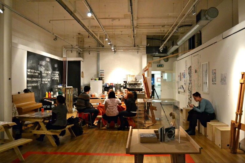
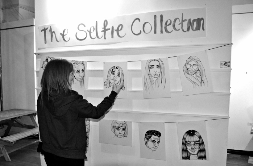
Marta booked the space for the exhibition for the entire day however we ran into a problem on the day of the exhibition. The student body who gave us the space did not inform the cafe that was in the space that we had booked it for the day, this caused a problem between my and i with the cafe owner. They also said that we could not move the tables in the space which was ridiculous due to the fact that we had to curate the space which means to empty it. However we made a deal with the cafe owner to leave the tables till 2, this was cutting it close for our setup as the show opened up at 5 but usually there is no one there that early so we took a gamble but worked like maniacs to curate the space in time. Hanging my prints became a nightmare as the nails would not penetrate the hanging wood I was displaying my work from, my friend Leon aided me in hooking the black cord around the ledges on the wall instead of using nails. This worked perfectly. Crisis averted! After hanging al of my prints using paperclips, our exhibition itself was technically quite loft, we had no smart arse graphics or devices to display our work, we simply went pretty old school in our exhibition. After setting up my pieces I set up my table to sell my stickers and prints. This didn’t take long and I had my table flush with Marta’s. We then set up a table with food and drink. I chose the table cover, plates and cups all in the colour orange as this was our signature colour for the exhibition. I suggested this to Marta as I thought it would show wed taken more interest into he decor than simply plain white table with food. We also chose childlike food, like hungry hippos and cheesy ball crisp. The tone of our show was not a crisp clean and graphic design, we are fun and lighthearted illustrators. Marta had no problem in her set up other than the easel falling over twice with her work attached, we fixed this by manipulating the legs so the easel leaned backwards as it was top heavy.
The shows open..
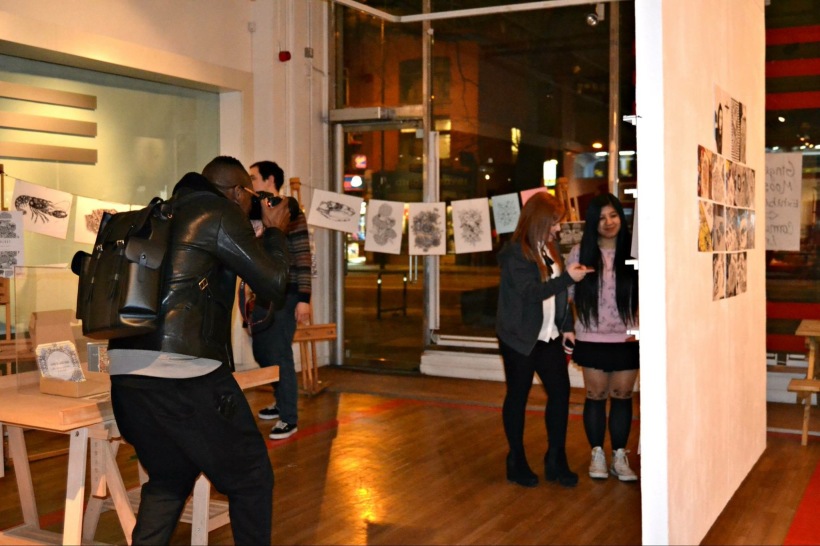
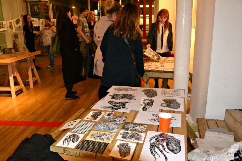
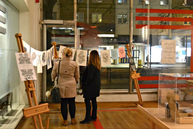
We had music playing, the space was curated, the floor was clean, we had the posters and banners put up in the building, we were suited and booted and ready. Marta sold almost all of her prints and every sticker she made. I sold one print and all stickers. This was great for Marta and I but we were little deflated about the small turn out, a maximum of twenty people turned out and maybe we didn’t publicise the show enough, but a lot of the students from the course we returning from New York so we knew the turn out would be halved. We canvased around the university telling to come to the show. Two tutors came to the show, Ricardo and Kieron which was lovely to see! We wrapped up the show around half eight. We received great comments on our prints and style of work from everyone who came, especially a group of girls from the street who came in on their way to a dinner date with their boyfriends, this was really humbling.
Opinions and improvements..
I believe i didn’t realise how much work and consideration there is to an exhibition you curate yourself with just two people, it could have been publicised more and to a more professional level. By this i mean more consideration taken to the flyers which were made very quickly in last minute, which means time management was an issue but i struggle with this due to my cognitive disabilities but none the less this needs work. However this has proved in informing Mart and myself on how we should work on our next exhibition, what to do and what not to do. More publicity and better advertising for the show is a major point and also the consideration to displaying our work in abetter way than we did. 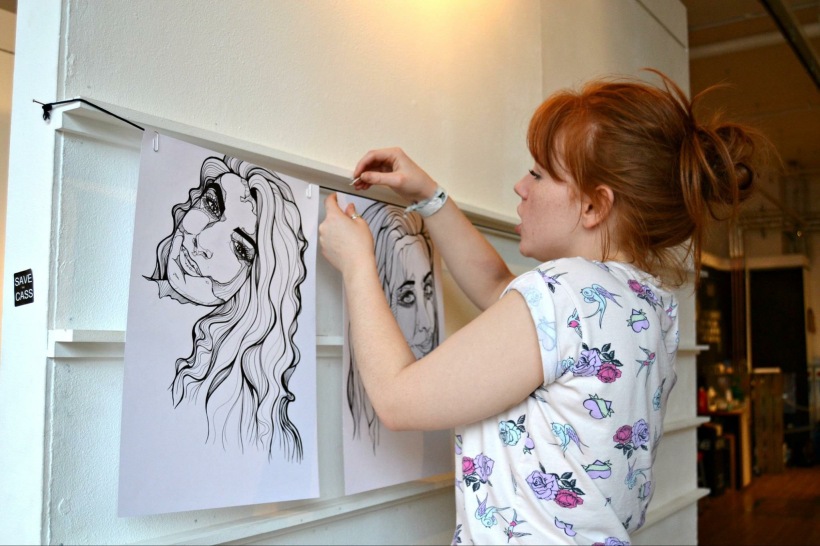


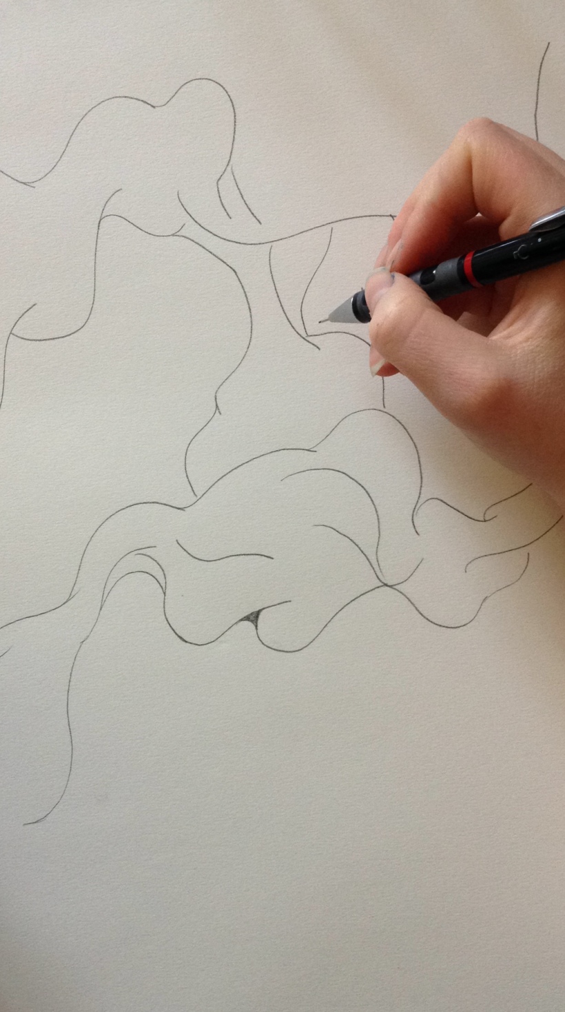
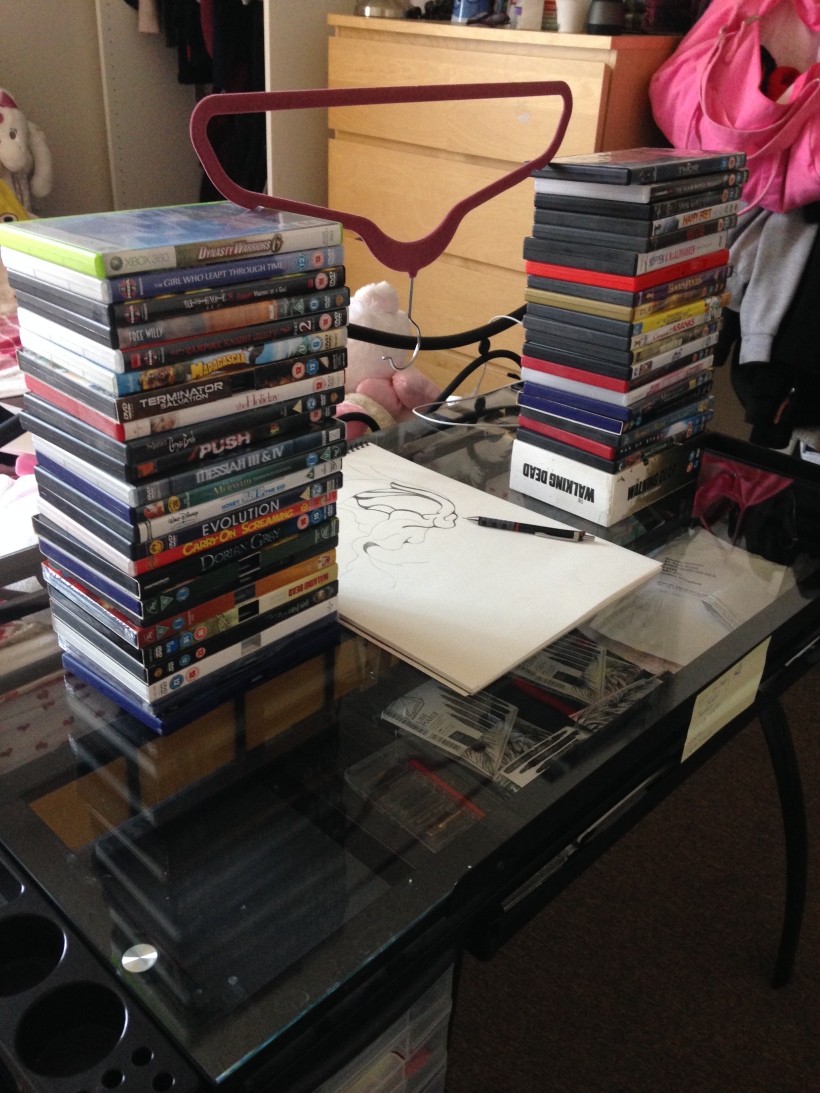
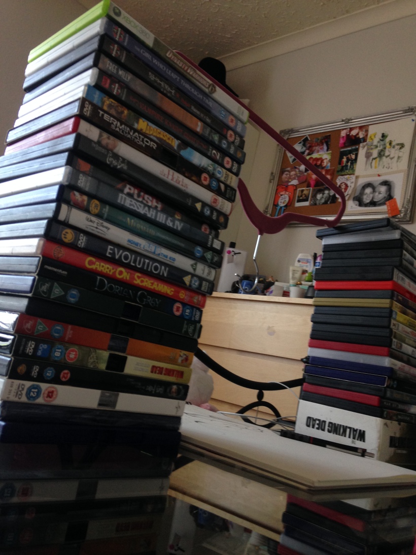
 After my tutorial with Susanna I toyed around with the idea of a video journal for my FMP documenting my experiences with add or dyspraxia. I made a mock up trial where I recorded myself speaking about my conditions as i drew on a aper pad. The set up was not exactly professional..I used a coat hanger to support my iPhone to record, I used a stack of dads each side to hold the coat hanger above my hands as I drew. I found this to be not very interesting for me as a designer, I didn’t think much of a video blog of me just speaking about myself, I wanted it to be something else..I”m not quite sure what but I’m not sure if i will continue with the blog in this way. But still it served as experiment and try outs.