Empathy & Enterprise. Hand in and evaluation of my year.

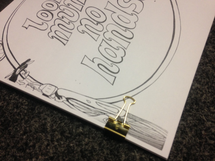
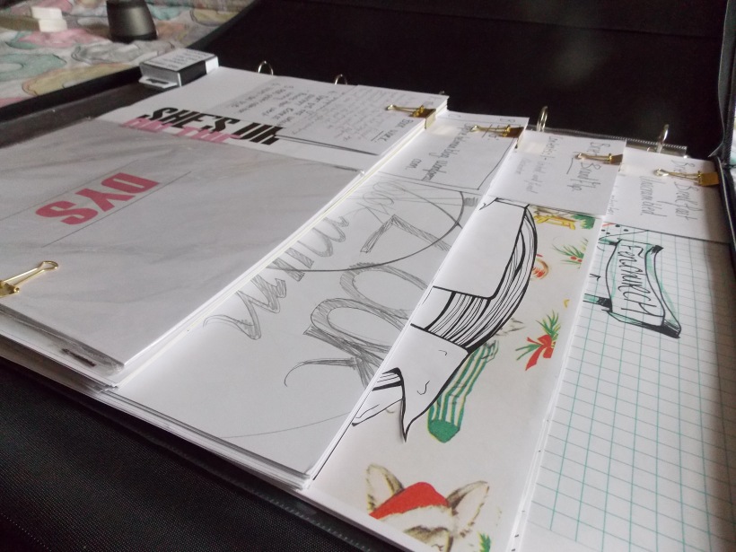
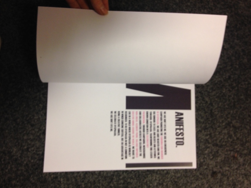
Handing in was a real pleasure to do because as i laid out all of my work i was surprised by how much I had to hand in. Initially i felt like my pile of work wouldn’t look particulate large but then i realised i had several Brand theatre pieces still in my studio space. I laid out all of my work in order of briefs, piled up my sketchbooks in order of there completion, placed my product prototypes on the side, and left specific annotations for each section of the piled work in order better help the examiners understand the work they were viewing beforehand. This i think helps them also to better engage with my project and allow them to see my continual development and iteration process as i came to a conceptualised FMP.  I feel i have worked my FMP to the best of my ability, however, as i have learning difficulties and should have been awarded the extension but was however not able to have an assessment in time before my hand in, if i had had the two week extension I feel i would have generated more work and possibly excelled the concepts of my website mockups further. Working with the time frame i and however I worked incredibly hard on digital work which i am not family with, i feel i have done myself proud in managing to render digital work in the space of five days before hand in after my project came into a review and told to rethink its visualisation. The Empathy & Enterprise studio has taught me a vast amount about Branding and the minute considerations taken in creating and excelling a brand. I learned through this module what a manifesto is, the brand ethos and what they want to achieve and stand for. I also learned a lot regarding concept boards,  market research, surveys, infographics, logo realisation, prototyping and  brand touchpoint. Each brief during the third year has served to simulate the practice of brand design. In hindsight I have enjoyed this studio but went intuit it thinking i would be learning and eventually branding myself as a designer and illustrator. This was not what I ended up doing. I have found that this studio has revealed how I excel more as a creative thinker  and find my struggles come to the physical visual communicating of an idea, something i will work on or work around by using methods to help overcome this. I have discovered a lot about my identity as an illustrator and as a potential designer and have found the final year at university to really be the year one straits to figure out who they are and what they’re intellectual capitol is.

Empathy & Enterprise. Hand in prep.

In preparation for my final submission i spent two days arranging work into piles by brief categories, arranging in order of development where each set of work lead onto another. Each pile i bound with a gold bulldog clip as a design theme and to also keep all the loss pieces together in piles. Each brief came with a contents page on the front and with each section having another accompanying card with a brief description of the work inside. I found that the Look Mum No Hands brief had a significantly large amount of work, with Brandflip being the lesser of the two piles. I wouldn’t say this was because Brandflip had less time spent ton it as this is untrue, but that the brief was more concise for me to accomplish and didn’t need any improvements after a review with my tutor like the Look Mum No hands brief did. The FMP had a decent pile of work to it not to the same thickness as the previous No hands brief but inside this pile was a larger array of iterations surrounding my final major project concept. All of my adobe digital files of my website mockups, mock up boards and PSD mockups are compiled onto a memory stick, along with my video, poster prints and other imagery associated to my FMP. I am ready and prepared

Empathy & Enterprise. Other works.

I had this idea of creating poster imagery using my old prescription medication I was given during my late childhood to early teenage years, Ritalin and concerta. I had the prescription bottle for my concerta still in my bedroom, although out of date the bottle was kept as I was supposed to complete that bottle and get another one however I hated taking them as they made me feel tired and as if I was not really awake, like sleepwalking. But as I began this FMP that was significantly personal to me I felt using the bottle would render some interesting visuals.

I however wanted to make the visuals all the more personal and I remembered distinctly how my mum was speaking on the phone to my Auntie as she peaked through the living room door watching me as I sat practically comatose after a day at school and having had my medication. She said how I was sat in the living room, still as anything, not moved for over an hour and how I appeared to be like a zombie. What I love is that I can remember this as if it was yesterday and this has remained with me for a very long time. The way my medication affected me was that it worked to inhibit the behaviours of ADD, the fidgeting and impulse behaviour that I suffered with. I didn’t like taking the pills as after a while they made me feel so tired and blank faced. Creating a series of posters I achieved by using the very words my mum spoke to my auntie and the visual image of the medication. In a sense I am making a propaganda poster but not promoting the medication for its benefits but for its side affects. I don’t believe the medication should not be used, my experience with concerta was not great but was not as bad as Ritalin. Ritalin was the worst of my medications and I strongly disagree with that medication being prescribed to young children even if it does work to inhibit behaviour, it comes with a long list of behavioural side effect. when I took Ritalin it made me more agitated, quiet to a point of comatose and incredibly fatigued, on few occasions I was ill from this medication which is why my mum stopped giving me it. So within these collective pieces of work they carry a heavy personal message of my experience with an impulse control drug. Printing the quote onto A3 page I cut up and stuck to the photocopies I made of the medication bottle and box in varying compositions. Some shots had the pills open and out on the counter, bottle close, outside the box, inside the box, both the box and pill together, I also threw the box across the screen as it copied which caught it just in time in a morphed bizarre image. I photocopied the side of the box that had the ingredients an d my name on adding fir that personal value.


IMG_0987
I particularly liked the graphic on the lid of the bottle and flipped this over onto the screen.
IMG_0986 (2)
I also played around with landscape for the composition and placing the  quote overlapping on itself.
IMG_0989
Enter a caption
IMG_0988
I focused on plain graphic shots of the medication itself as it created a clinical tone to the image.

IMG_0990 (2)FullSizeRender (10)FullSizeRender_1FullSizeRender_2FullSizeRender_3


Empathy & Enterprise. Brand Guideline printout

I printed my brand guidelines on 200 gsm paper in colour and bound with gold bull dog clips, a theme I have used for binding of all my works for submission. Upon printing everything was laid out straight and correct, after printing and biding I realised how again there was a problem, the pages were all slightly off kilter. This was incredibly infuriating but the more I looked at it, the more I felt this lent itself particularly well to the topic of Dyspraxia and the difficulty those with Dyspraxia have with writing in and on a straight line. The brand guideline consisted of how to make the logo, colour schemes, colours schemes not to use, typefaces and a manifesto.IMG_0977IMG_0978IMG_0979IMG_0980IMG_0981

Empathy & Enterprise. Website Mockup printing.

FullSizeRenderFullSizeRender_1

FullSizeRender_2
Closer inspection shows how the layout appears smaller than the other two mockups , something I didn’t realise until I had brought the prints home.

FullSizeRender_3

FullSizeRender_4
After the page came out I saw that the ink depleted on the logo in the corner and therefore I couldn’t use this print for a final mock-up for submission.

FullSizeRender_5
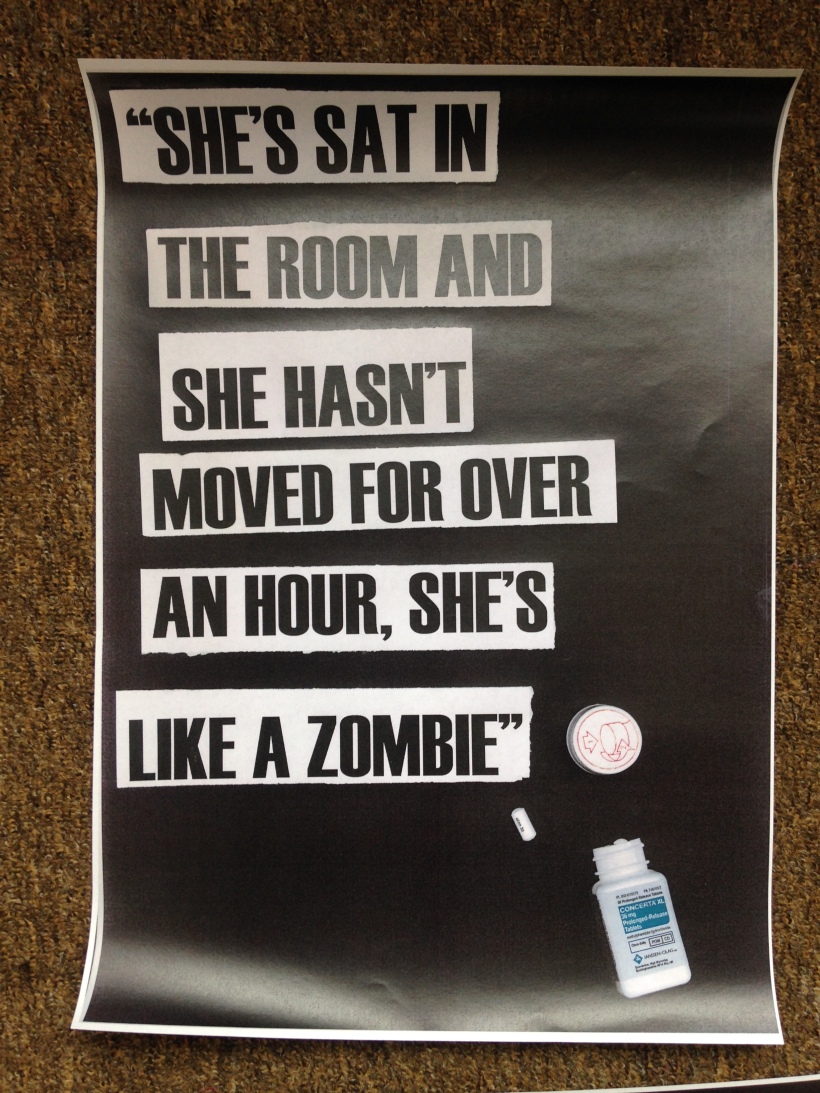
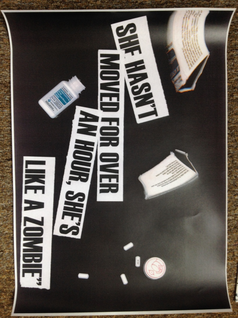
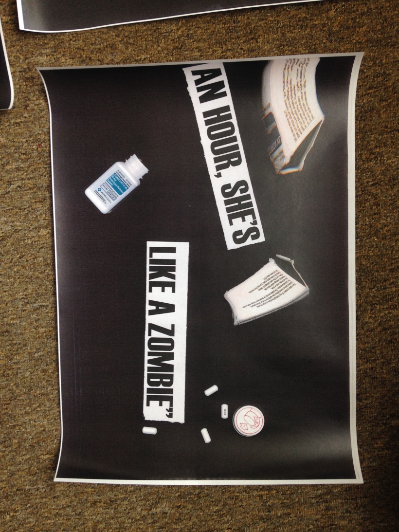
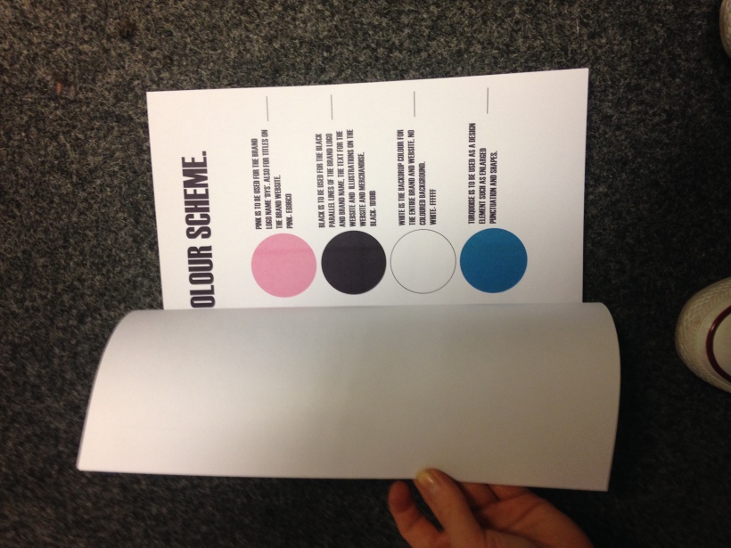
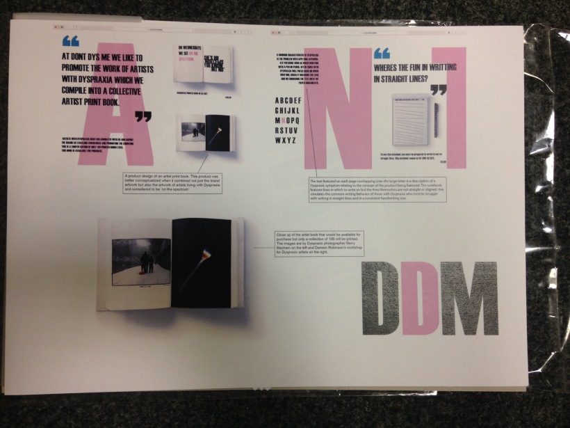
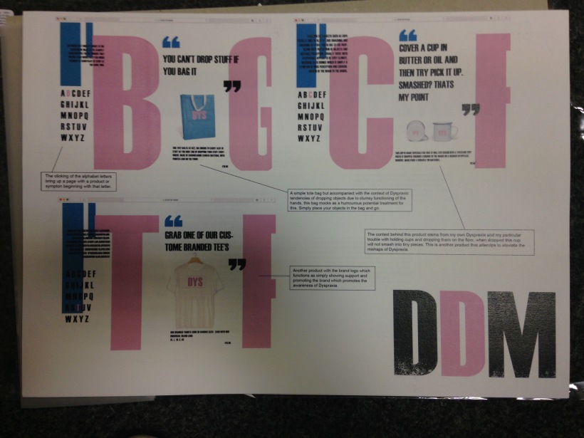
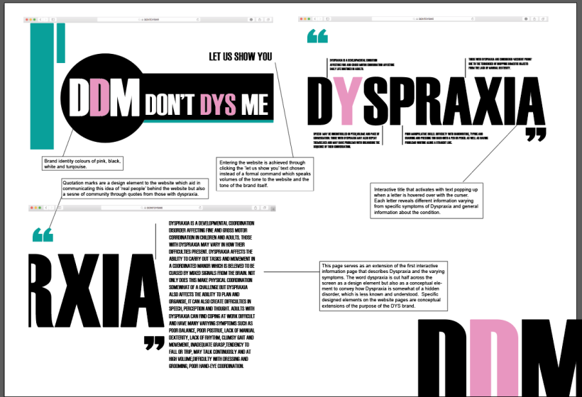
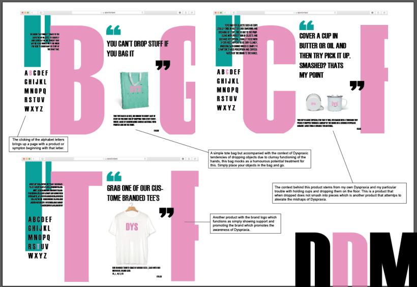
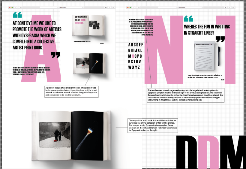
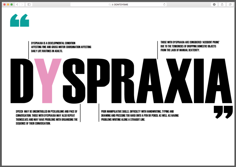
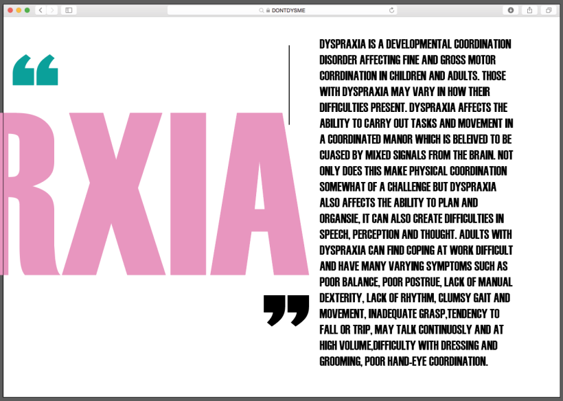
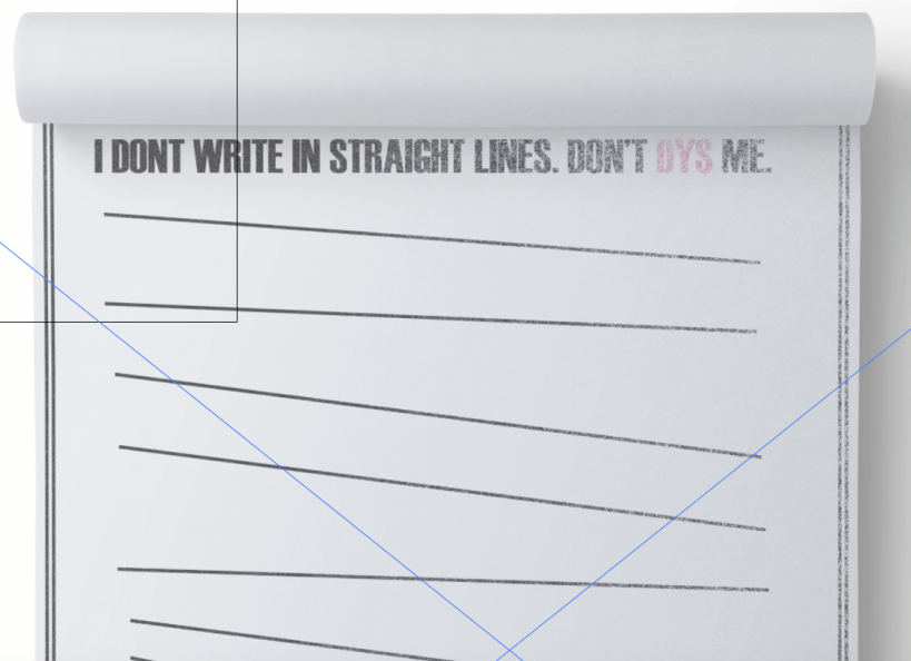
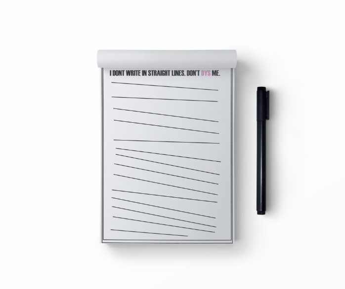
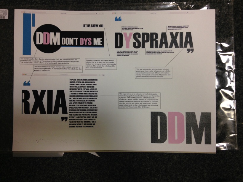
After spending a week on website mock-ups and making them into a series of display boards of the components to each part of the website, I printed them onto 175 gsm paper and then intend to mount them onto display card. The printing process had a few problems when the ink ran out on one print and then smeared across the edge of another, ruining two pieces of paper. I had only two more pieces to work with and if the printer ruined these two then I would have to resort to using the low quality printer paper. Thankfully I went to a different printer and they came out perfect. I went over the text meticulously checking spelling and believe I corrected all mistakes. Each board I placed the brand logo on the bottom right of the page which was supposed to be cut off the page but when I exported this it came out fully rendered on the page. I did not realise this until I had printed each of the mock-ups. I also realised that one mock up was smaller in its layout with the website pages sitting closer in the middle of the page, I do not know why this happened after I exported this. I believe that if these are to be exhibited at the summer show this particular board mock-up will need to be re done. I completed this digital collection of work to the best of my ability and am surprised at what I have managed to create as I had never seen my visual communicating being achieved through digital means. Since using digital means to create I am now determined to gain a sound knowledge of programmes such as Photoshop, illustrator, InDesign and even premier and after effects. As I do not want to limit myself in any field of creating. The more I know the more diverse my creative skill set and the more platforms my designs can reach.


Empathy & Enterprise. Look Mum No Hands Revisit.

With the deadline looming I went over making sure I was not only rendering work for my FMP but also completing  previous briefs from the interim assessment. My work for the brief Look Mum No Hands was not finalised so I went back over the work I made for this project, the work ranged from sketches and photographs of the café itself, the space we were investigating and a large collection of prints from photocopying. The first rendered outcome I made was an illustration of the brand component which included the signage if the window, an observational drawing of the occupants inside the café on one day and the bicycles above, all encompassed into one illustration. As I was told this wasn’t effective enough in hitting the brief I was told to re iterate it somehow, so I took my illustrations and played around with it on a photocopier and folding it up. Usually I re work a piece by physically reworking the piece I have just as a process that seems to work for me. I made a series of illustrations onto acetate to begin with simply to maybe experiment with different mediums. I found this project in the beginning particularly dry as we were to create an illustration of our interaction with the brand touch point within the café, which to me didn’t allow for as much creative freedom as I wanted. But this wasn’t necessarily a bad thing in that these creative limits essentially give us a taster of the industry of branding and the creative industry itself, meaning that when we enter it and most likely work for someone else for  a period of time we wont get much creative freedom to do whatever we want as we will always have a brief guide to follow. So I made a compiled collection of morphed and reiterated illustrations of the café and searching through these I decided to work with them. I did not have a lot if time to spend on this project in the few weeks before hand in to revisit, so i worked with what I had made my collection of my morphed illustrations into an A4 printed book. This process didn’t take particularly long but when it came to printing I had to place my paper into the bypass tray as I jammed the printer with my own paper that was 200gsm, too thick for the printers to work with. After this slight hiccup I managed to render a final outcome for the look mum no hands brief which was only a two week running brief. I was happy with the outcome as it included abstract versions of my initial outcome for the brief

IMG_0960IMG_0962IMG_0964

IMG_0961
I bound the book using gold bulldog clips that I feel contrasted well against the black and white print to the book.

Empathy & Enterprise. Video finished.


https://vimeo.com/user45796169 – link to video on vimeo account.

As I am nearing the end of my process and finishing off work for my final summative hand in I struggled on editing my video for submission. I had the much appreciated help of my friend who essentially took over the process and edited the video for me as I was still in the process of making mockup websites. i sat close with the process explaining what I wanted and this was done. The video footage was not of great quality as my camera is old and is not a film camera but i did not have the time to re film all of this so I worked with the footage i had. I had several clips that were not of any use due to the camera shaking, me forgetting to curse on command after the object dropped, the object falling out of shot or the background noise interrupting the shoot. I wanted the tagline for the video to appear at the end of the last video footage but through the editing process we came to the conclusion that the title looked better at the beginning of the video as it gave the video context. The type appeared in fast single edits which were quite punchy, linking very well with the manner in which i dropped the objects in the video. I am not a fan really of using video as a piece as i am completely at a loss with what makes a good camera angle and the editing process seems incredibly difficult. However i did think this of digital design work and i have powered through a week of digitally rendering pieces, so perhaps I will venture into video more so in the future, I won’t rule it out as an option. This video is far from perfect but will have to suffice as I have set no more time for processing pieces now as i am now spending the next two days going over sketchbook checking i meet the learning outcomes head on in preparation for the hand in.  Improving this video would include  using a professional video camera or atlas a more sophisticated version of my own, planned camera angles which would be held at the exact position for each clip-a tripod would be effective in achieving this. Essentially i was focused on capturing this footage and creating a quick video, obviously the video is not a focal final piece as the attention to detail would be to abetter level, the digital pieces i have been working on are in fact the central pieces. I however didn’t want to hand in FMP only in flat  formats, this way I have made a compilation of photocopy prints, hand rendered illustrations, digital mockups and a video.

Screen Shot 2016-05-20 at 6.57.26 PM

Empathy & Enterprise. Website mockup refining.

Screen Shot 2016-05-20 at 3.13.34 PM
Finalising the mockup boards for printing today i corrected spelling and tweaked the annotation for each mockup so that it relates to the conceptual design of the brand and the concept of Dyspraxia. 
Screen Shot 2016-05-20 at 3.13.41 PM
I added square text boxes to add a cleaner look to the annotation and composition of the boards. I have rendered three boards with three website mock ups on each page. I chose to only have three on a page as I knew there would be a considerable amount of annotation for each mockup, and having four images to a page would be too cluttered to cleanly arrange a board. I am extremely pleased and shocked at how my boards have resulted as i never thought i could render something as digital as this and feel content about it as a solid final concept for my FMP.
Screen Shot 2016-05-20 at 3.13.52 PM
As I had only two pages for the last mockup board I included a single image of the artist book product as I was particularly liked this idea and am considering making this as one of the final pieces to display at the end of year show. Although this book will be printed as a traditional binding but also a second copy where it is bound in a way that makes it difficult to open and read the book. 

Empathy & Enterprise. Website refinement.

Today i realised i wanted to add another page with amore in-depth description of the disorder of Dyspraxia so remembering one template i had seen previously, I made this page giving an overview description of the disorder. Listing the symptoms and what Dyspraxia is in such detail. Dyspraxia is the developmental coordination disorder that affects fine and gross motor coordination in children and adults, it is not just a physical condition but also one that affect the ability to plan, organise carry out daily tasks such as grooming, chores and conversing with others. I wanted to tell this as i felt I had emphasised the physical problems of the disorder which are the most evident whereas the real nitty gritty to this disorder is its ability to completely muddle up the function of the brain to carry out a simple daily task. This is why I struggle with planning journeys, travelling on the london underground, following simple verbal instructions, remembering things such as materials to bring telcos, remembering deadlines and managing my time. I made this page and also more information to the interactive page of Dyspraxia. Screen Shot 2016-05-19 at 4.26.32 PMScreen Shot 2016-05-19 at 4.26.49 PM

Empathy & Enterprise. Website mockup notebook.

Screen Shot 2016-05-18 at 3.03.00 PM
Working on the notebook product psd for another website mockup. When making this psd I managed to render a quick digital illustration on  illustrator then  added a slogan text to it, then uploaded this onto my website mockup. I however did not save the file first in a high enough quality, i saved it as a jpeg and this was the grainy half rubbed out image I got. I quickly changed the saving presets to a png and the file came up perfect when placing it into illustrator.  
Screen Shot 2016-05-18 at 3.16.37 PM
This notebook works on the characteristic symptom of pressing down hard onto pens and pencil when writing. This was common thing for me to do during my primary and secondary school education, I would write my sentences in very big lettering and  press down real hard onto my pen. I always preferred pencils which were usually a 2B and would only prefer the pencil when it was semi blunt as it made the lettering bigger. The process for this mockup took little time as I am now quite fluent in my own work process from making a new illustrator file. setting out the capitol type, the accompanying text, design element, url bar then uploading the psd, editing the psd, saving the psd, uploading it onto illustrator and finishing a mockup.This process has taken awhile for em to become used to as I’m not used to a lot of digital work, I have had several migraines from sitting at the computer doing these digital mockups which took some getting used to as well but the more i look at the pieces I am rendering, the more confident i feel with my FMP than i initially did a few weeks ago.