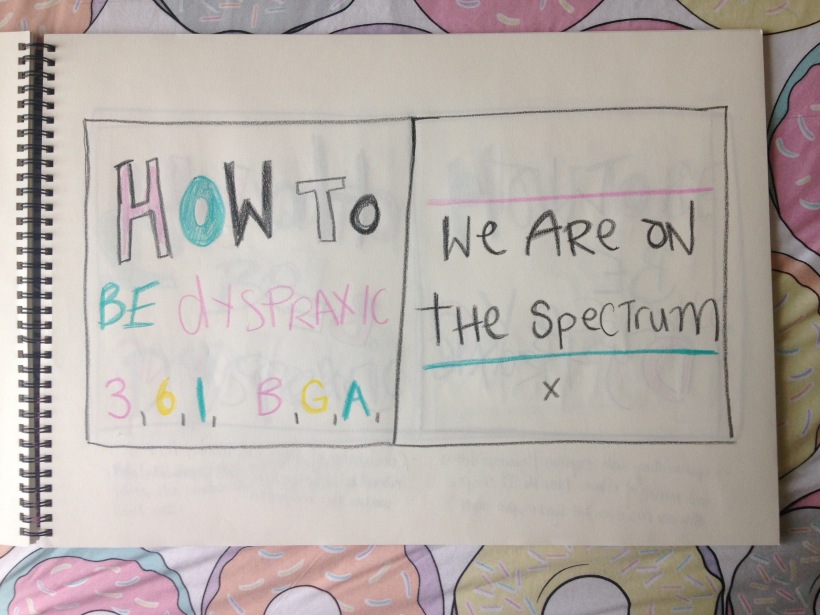
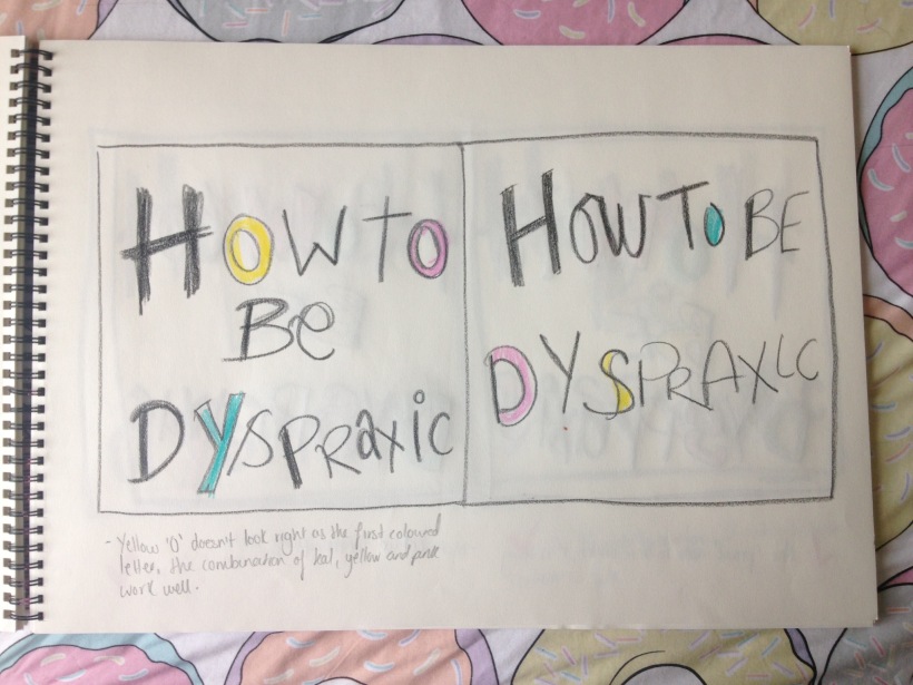
I played around with using some of the word play fro my Dyspraxia themed work, I made a mock up poster of ‘On Wednesdays we sit on the spectrum’ , a play on the popular Mean Girls movie quote ‘ On Wednesdays we wear pink’. I highlighted the on the esecturm in pink which is where the we wear pink would be, wether this needs more development I am sure it does such as the type needs to be a bit thicker in my opinion.I’m glad I’ve finally made a little start with the poster wordplay as an accompanying component to my project. 
Month: April 2016
Empathy & Enterprise.Development.
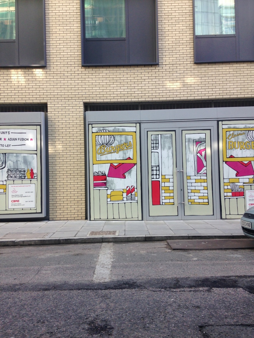
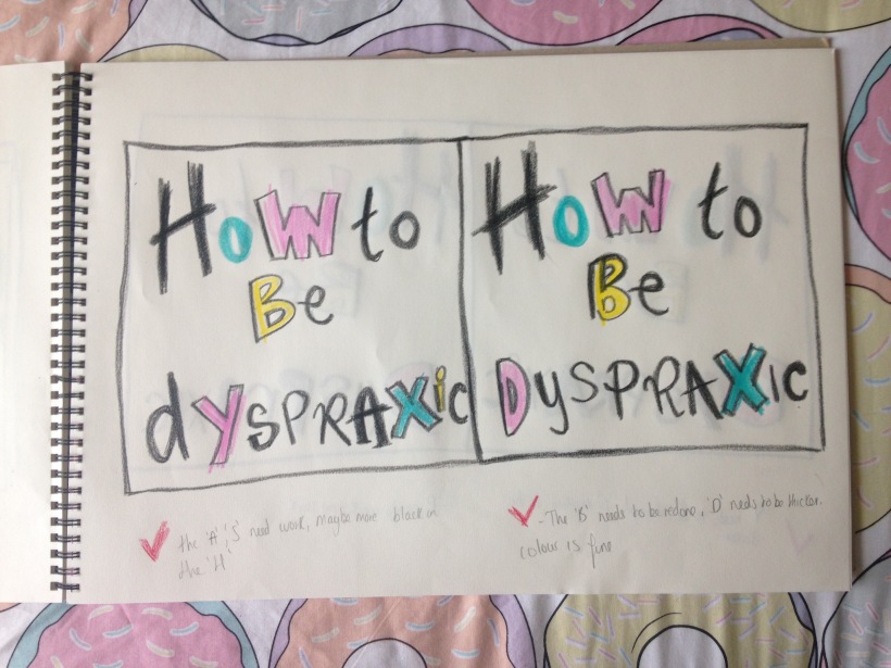
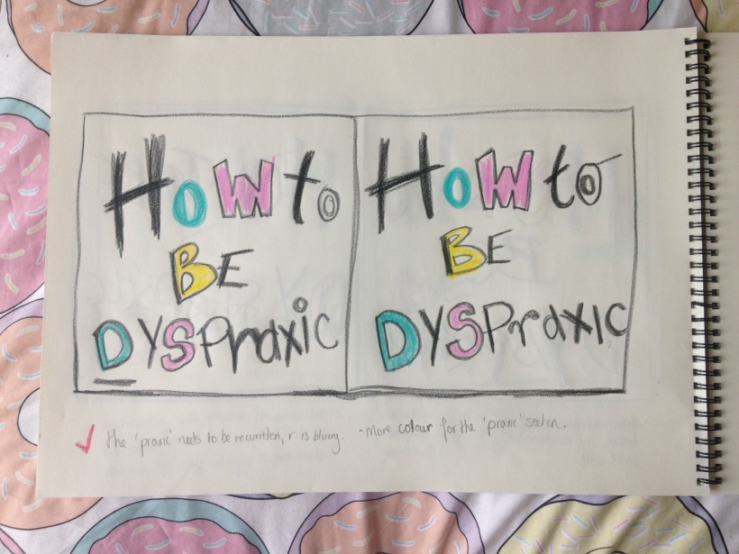
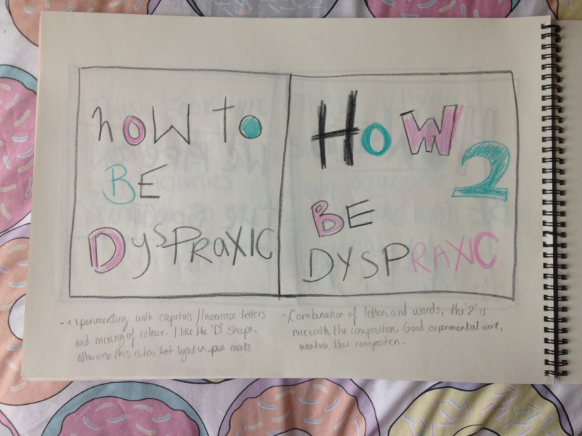
Today I continued work on my type for the pages of my dyspraxia book. Originally I wanted to write entirely in black wax crayons but since doing so I have found that doing this is a lot harder, the density of the colour is not as dark as I want and the letters are too large to fit onto A4. So i have been using black marker and a combination of using coloured wax crayon for the first capital letter of each page. I think the pages will look better using marker instead of fully wax crayon. Ill continue to make variations of both for each text page and decide afterwards. I also photographed a painting on a window on the way into university as I liked the hand rendered style and I thought may lend itself to ideas for my illustrations perhaps, maybe, just gathering some visuals.
Design competition. Secret 7 again.
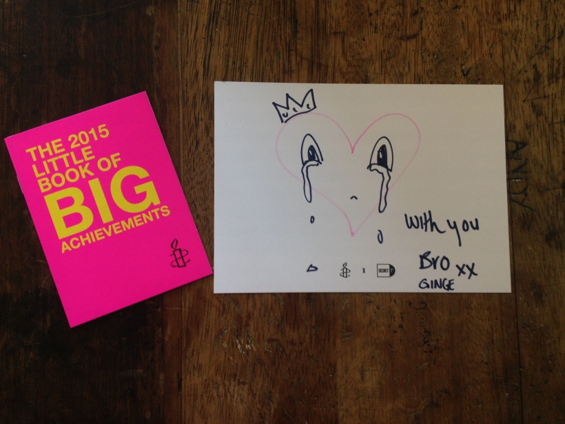
Before we left the secret 7 show there was a stand where pile of postcards were piled up where people could write a postcard to be given to illustrator Lunar who is facing along term prison sentence for tweeting posts condemning the jailing of a politician in Malaysia. This idea is in part with Amnesty international and i wrote a post card to be given to Zunar.

Empathy & Enterprise. Summer show space.
Adrian spoke to us today regarding the summer show and we went to central house to see the space and consider how we would best use it. There was a census with Adrain regarding the idea of using large wooden boxes that would house each students work, they will be painted white on the outside and painted any colour each student desires on the inside. We felt this would be a creative way to utilise the space since the space is white small. We have to build an argument to present to Sara and Rachel saying why we will be using the budget for this and if so, adding our own money. As a collective the summer show leaders from our studio are handling the costing and sizing for the wood for these large display boxes. We believe this would be a great way to really present the branding thematic to Empathy and Enterprise. The space itself is a lot smaller than last years show for the Uncanny studio I was in but we feel we can work well with the space if this box idea goes ahead bearing in mind if our argument for the proposal is so great they can’t say no.


Design Competition. Secret 7 show.
I visited the Secret 7 show today with fellow colleagues and saw some wonderful sleeve designs. I did not submit my work for this competition as I did not finalise it in time nut there was some particular illustrative sleeves that instantly caught my eye. The first two images were my favourite sleeve simply due to the illustrative style and vibrant colour.


Empathy & Enterprise. FMP refining.
Using wax crayons I began working on the type or my book which I will be hand rendering, The inspiration for the style of this book is a combination of keri smiths Wreck This Journal series and my own colouring drawings I did as a child, I have vivid memories of using the colours pink, yellow and teal or baby blue on white paper which were apparently my favourite colours to use a kid when I used crayons. I am using this for my book title as essentially this project is about my self but also lending itself to creating awareness to a disorder through myself as a platform.

Empathy & Enterprise. FMP refining.
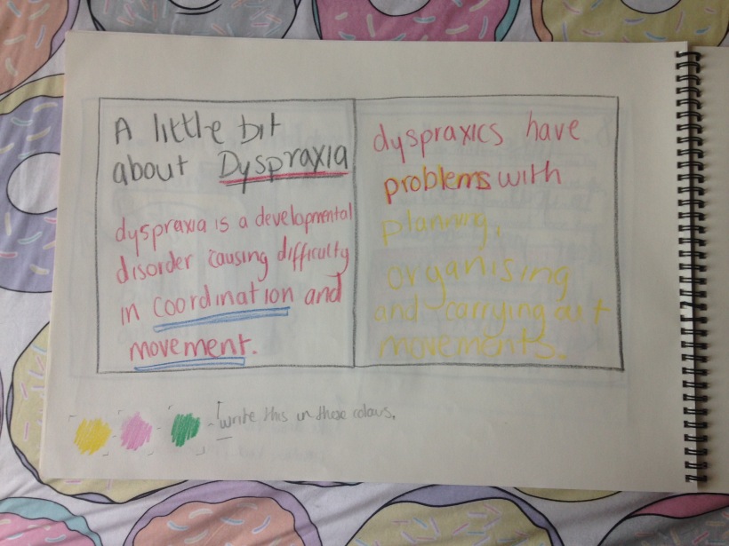
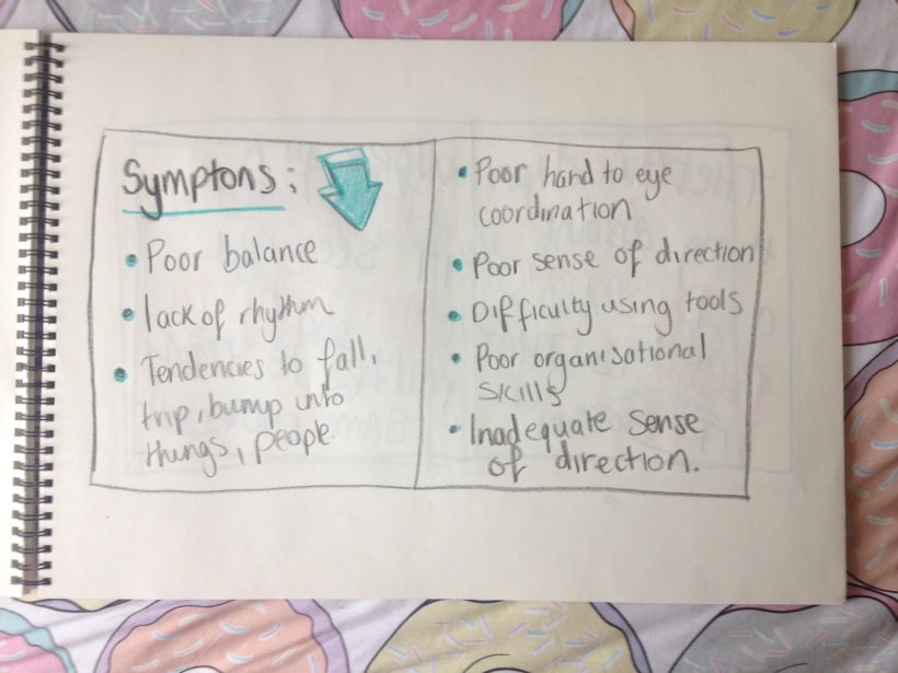
I have been working on my illustrations for the Dyspraxic book and I knew I wanted to use a wax crayon for the type as I wanted that child like playfulness to the book. I purchased a pack of crayola crayons and began illustrating the pages properly. I added pages about dyspraxia and the symptoms of the disorder. I also illustrated the front cover which I had most fun doing. 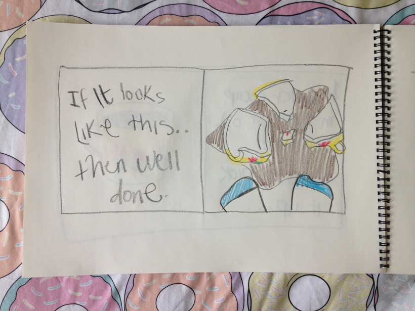

Empathy & Enterprise. FMP work.
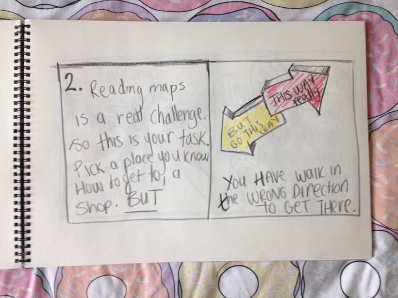
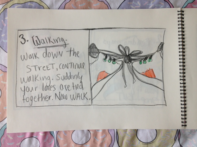
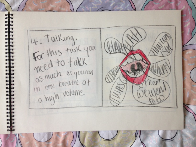
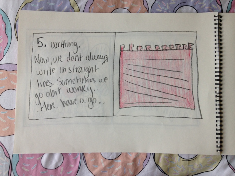
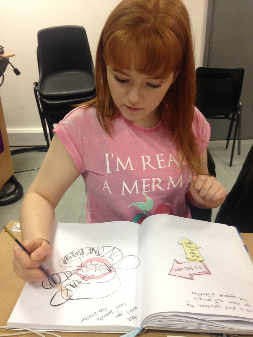 I began work on my Dyspraxia book using water colour paints to illustrate the activities for the reader to engage in. I used the paints first and then used a fine liner open to go over the pencil lines, this created a nice loose illustrative style which is what I was aiming to make. The keyhole illustration needs reworking and illustrating in a different way, also the lips illustration needs to be reworked a little neater and the type needed changing. I enjoyed illustrating my ideas as I felt it was finally coming together. Initially I pondered on creating a more photographic black snd white book but I felt this would take away any humour and light-hearted tone I wanted to convey, I don’t feel as if a shock advertising of Dyspraxia would be particularly effective as much as humour. Everyone loves a giggle.

Empathy &Enterprise. Ricardo session.
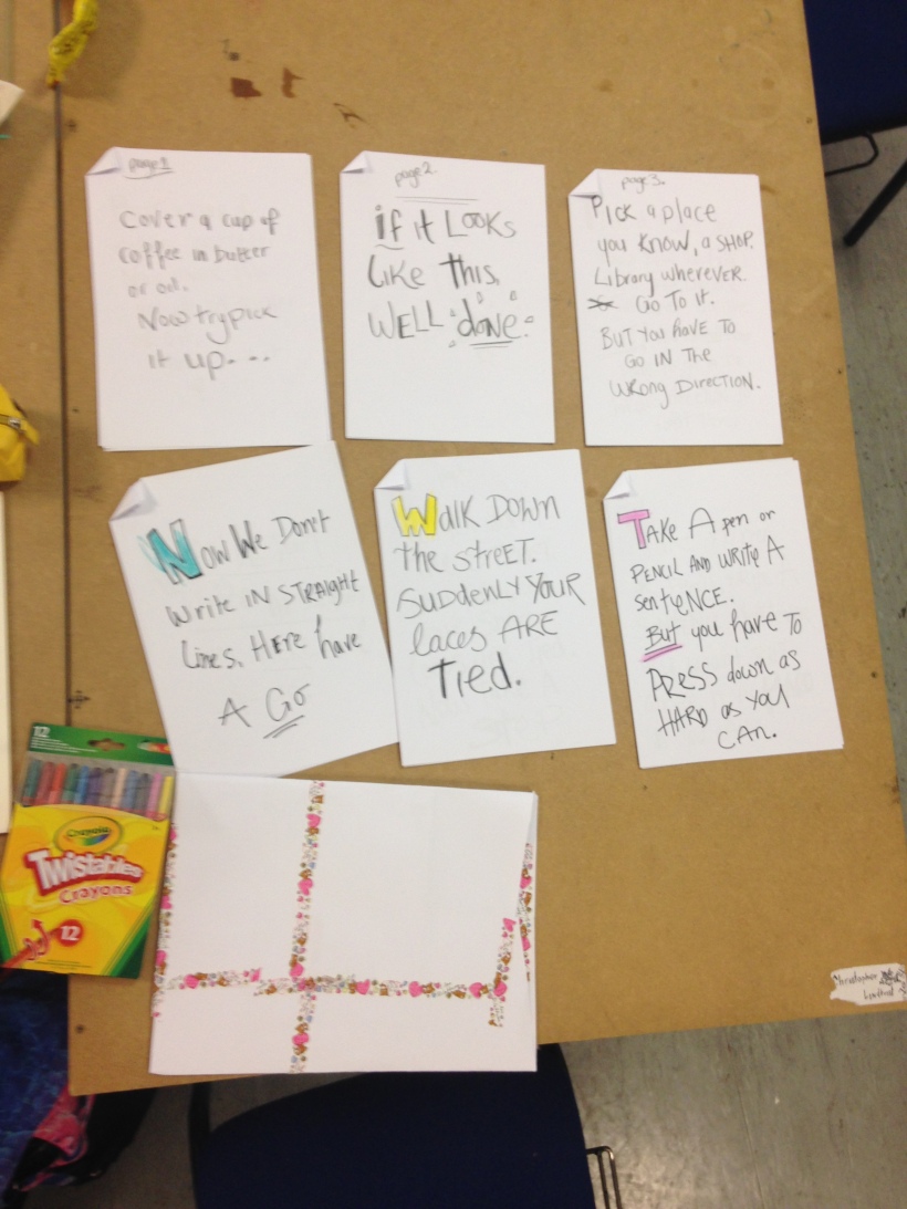
Ricardo ran a session for the whole day with our studio which focused entirely on our project hand in and considering the mechanics for the summer show. Firstly Ricardo asked what the deliverables were for each project and how many projects we had to hand in, this was already a bit of a brain ache as I had forgotten the deliverables for most projects, which I am now currently writing down from the given briefs. So far I have five projects to hand in which are my FMP, Look Mum No Hands, Breakfeast Unscrambled, Brand Theatre and Brandflip. Generally I feel I have work for each project, Brandlfip I am most happy with, Breakfast Unscrambled I feel needs more work and the Look Mum No Hands needs finalising. After this we sent the day considering our summer show, individually and collectively as a group of work. We had to analyse our project processes and identify a to do list for each project so we can have as much work finished and ready for hand in. Ricardo made us actually consider the exact details to our hand in, he asked me what I am handing in for my FMP. I said that I am handing in a Dyspraxic book, instantly Ricardo asked me several questions, what book size, paper quality, type of binding and what printers I am considering. Initially I considered just blurb to print my book , now I am more than likely to go to ABC Printing as I can physically go in to the printers and choose paper type right there and then with the printers themselves. For the day we had to consider the ways in which we would display our work individually and collectively curating the show as a studio. Since we are a branding studio we have all unanimously decided we want white tables and brown back boards to create a unifying colour pallet through the space, last year we had simple brown tables and boards, this time we wish to really design the space. Regarding my book I am considering 100-120gsm for the pages inside with a hardback cover or a much thicker card type. I hope to have a hardback and a paperbound copy of my book as well as an experimental book that works to physically convey a disability through either having the binding in a difficult position. Depending on budget however, I may just have two paper bound books. We were given the task to visualise our display space in the show, which we all drew our spaces and how we would individually display pour prints and other object pieces. For my space I will be displaying prints of my dyspraxia word play, brandlip poster, screenshots of a potential video, two printed books and possible print out posters of a few pages, and a small installation piece of a broken cup with a sticker attached. Doing this task aided us to really consider space beforehand which gives us the opportunity to make special requests for furniture and props for our studio, as an example our small group of four, me, Marty, Chris and Eduardo, we proposed having our work housed in open plywood boxes which separated our work but would also be great brand touch points for our show space. However the budget for our studio would not stretch far enough as well as having other props and materials needed, but the idea was great as we were considering other options other than the simple table and macs.


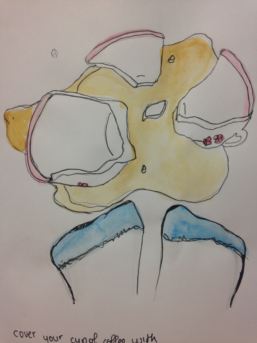
Empathy & Enterprise. FMP sketching.
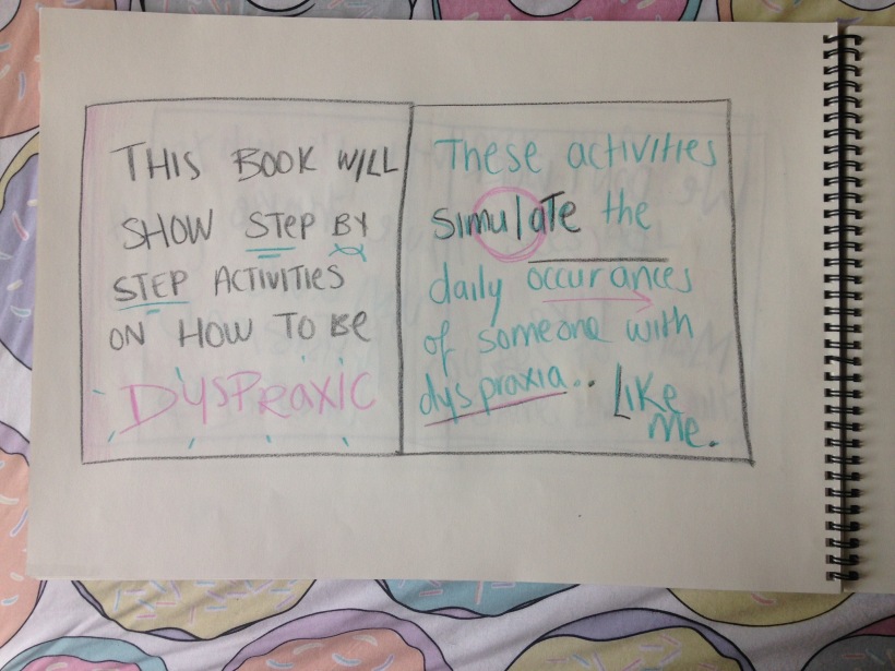
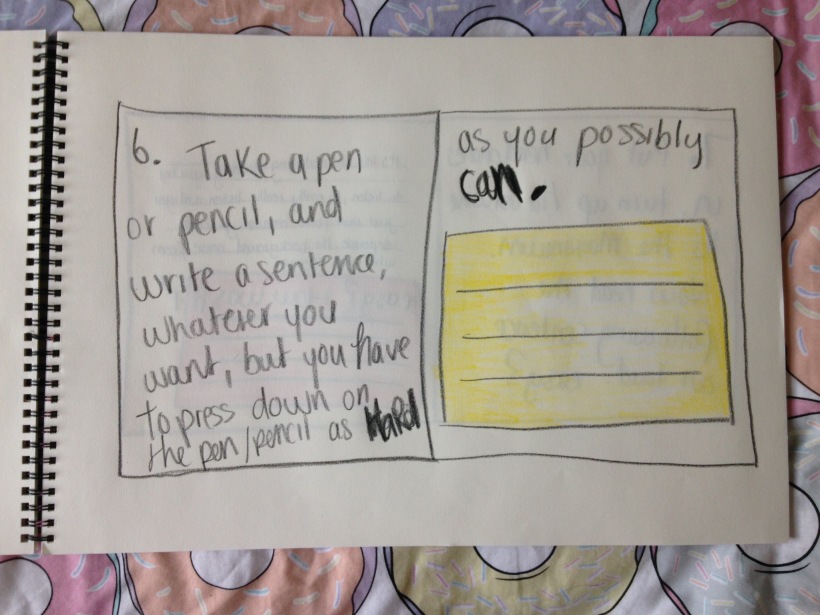
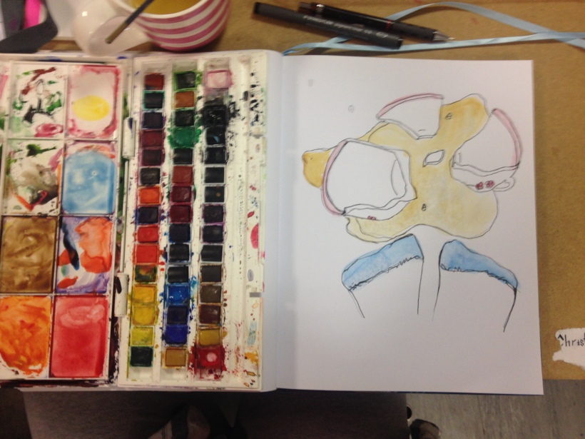
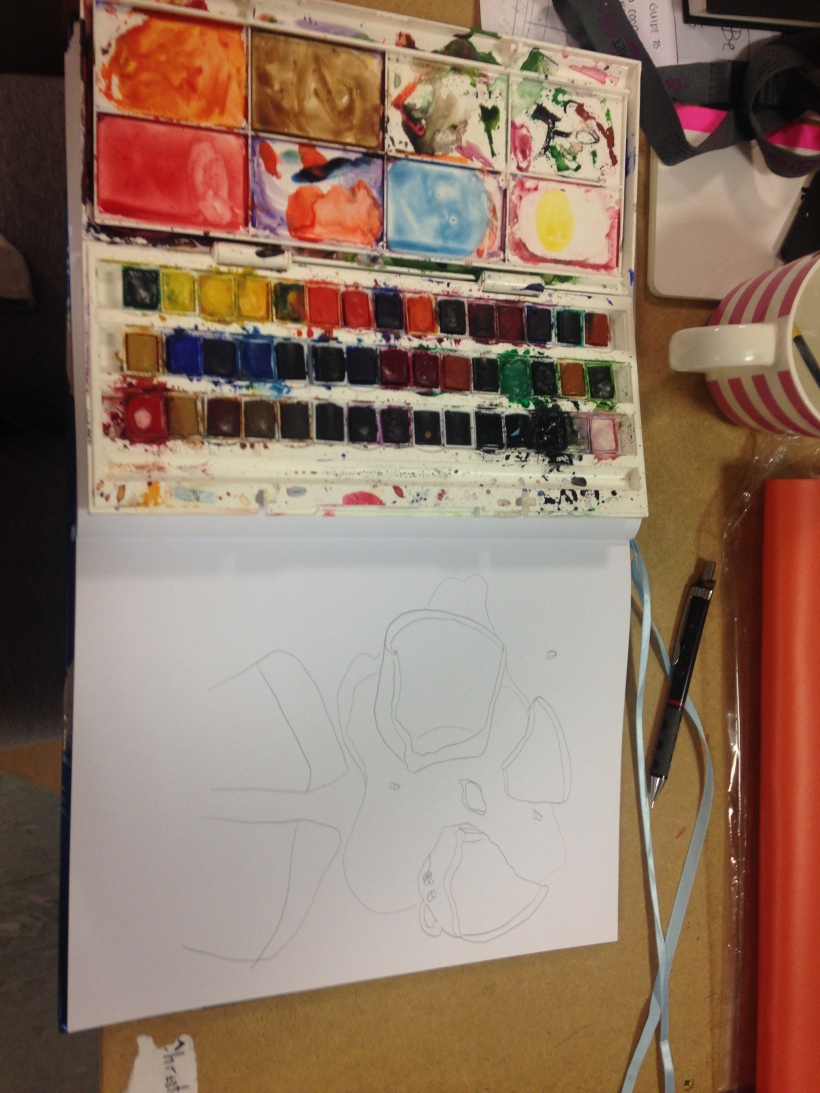
- I illustrated drawings for the how to be dyspraxic book. I sketched out broken tea cups, keyhole, chatting mouth, can tin opener, lamp posts, spiking cups and hands. Each instructional activity will have an illustration. I worked with pencil then ink then eventually watercolour.


